The Visualisation Engine
Using the simulation engine, the modeller may define an output file containing, for example, the number of individuals in different disease states for every time step. The visualisation engine can then read this output and create multiple dashboards with different types of graphs that can help in analyzing the results and in Visualising them.
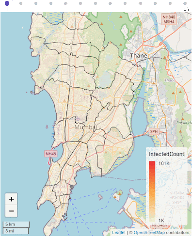
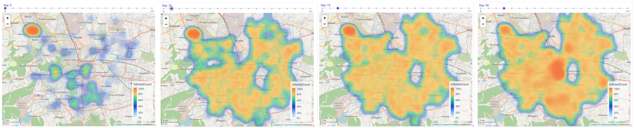
The visualisation engine is self-contained, and can accept and Visualise any CSV data file. Each dashboard can possess a combination of different graphs and charts, from line-graphs, histograms, and pie-charts. Additionally, the visualisation engine can also represent GIS data in the geoJSON format to plot heat maps and choropleths, which can either be static, or which can change with time based on the data provided in the input CSV file.
The visualisation engine is self-contained, and can accept and Visualise any CSV data file. Each dashboard can possess a combination of different graphs and charts, from line-graphs, histograms, and pie-charts. Additionally, the visualisation engine can also represent GIS data in the geoJSON format to plot heat maps and choropleths, which can either be static, or which can change with time based on the data provided in the input CSV file, shown below.
Features of the Visualisation Engine
The visualisation engine provides a variety of different features:
Data Import: The visualisation engine can import data in ZIP, CSV, and GeoJSON formats. The user can add, delete, and link files from different dashboards and can also add columns with custom formulae.
Charts: The user can represent time-series data as a line-graph. Additionally, bar charts, histograms, and pie charts can be used to study aggregated data. Geographical information and data can also be visualised. Spatial variations in data can be visualised using either heatmaps or choropleths. Heatmaps visualise data in the form of “hot” or “cold” spots, with a warm-to-cool color scheme. Choropleth maps can also be used to visualise how quantities vary across a fixed geographic area like a district or state, while simultaneously showing the extent of variation within a region.
Project & Dashboard management: Users can create a Project which can have multiple individual dashboards for better analysis. Users can add, edit, and delete projects and dashboards for better management. Dashboards are auto-saved to avoid data loss. Users can easily add, edit, duplicate, and delete widgets and charts in each dashboard. Dashboards can be duplicated to allow users to duplicate certain design choices and widget configurations. Each widget also allows the users to export the output either as raster or vector data using the PNG and SVG file formats respectively.